What Is the Zero Correlation Meme?
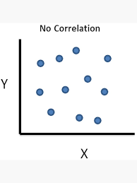
The Zero Correlation meme is the internet’s new favorite way to clown on cause-and-effect delusions. Think of it as a big, smug scatterplot that says, “These two things have nothing to do with each other—and yet, here we are.” It usually shows two variables plotted together with a flat or near-flat trend line, then a deadpan caption that obliterates shaky narratives, fake hot takes, and creative post hoc logic.

“As you can see, there is zero correlation between ‘I bought crystals’ and ‘My Wi‑Fi speed.’”
From dunking on bogus sports analytics to roasting corporate spin, the meme thrives wherever people try to force connections that simply aren’t there. It’s the internet’s chill but savage peer reviewer.
Why It’s Everywhere Right Now
We’re seeing breakout interest around this format—fast. The vibe: quick, visual, and painfully relevant in a world where dashboards pile up faster than context. With timelines overflowing with cherry-picked comparisons, the Zero Correlation meme offers catharsis: a one-frame “nope” that speaks fluent data without needing a PhD. It’s funny because it’s true, and it’s shareable because it’s simple.
The Core Formats
- The Scatterplot Slapdown: A cloud of dots, a nearly flat regression line, and a label like “Energy drink consumption vs. productivity during meetings.” Translation: you’re tired; the can isn’t the villain.
- The Dual-Image Disrespect: Two unrelated photos side by side (“Number of cow sightings” vs. “Bitcoin price”), with a caption: “Zero correlation—stop asking.”
- The Spreadsheet Screenshot: A tiny correlation coefficient (r ≈ 0.00) highlighted like a crime scene. Bonus points if the rest of the sheet looks unhinged.
- The Professor Parody: A pretend lecture slide: “Correlation ≠ Causation. In this essay, I refute your text at 2:17 a.m.”
How to Make One (Fast)
- Pick two chaotic variables. The more culturally specific, the better. Example: “Length of TikTok audios” vs. “Attention span during work calls.”
- Generate the visual. Use any chart tool, screenshot a stats app, or mock it in a design editor. For maximum comedy, make the trend line hilariously flat.
- Label with precision—and sass. Clear axes, punchy title. Keep it dry: “No Relationship Detected (We Checked).”
- Caption like a scientist with a grudge. Add a deadpan note: “p > my patience.”
- Ship it with context. Drop it as a reply to a spicy take, or post it solo with a wink.
Pro tip: If you can’t chart, use the dual-image format. A photo of “number of times I watered my succulents” vs. “email response time” gets the point across just as well.
What Makes It Hit
- Relatability: Everyone’s seen a chart used to sell nonsense.
- Visual punch: One glance, one laugh. No paragraph-long setup needed.
- Built-in literacy flex: It rewards people who know that “correlation ≠ causation” without being gatekeep-y.
- Roast utility: It’s the perfect reply meme—polite, devastating, and screenshot-friendly.
Common Pitfalls (Avoid These)
- Accidental correlation: If your dots secretly slope, the joke misfires. Keep it random or very close to zero.
- Too much jargon: It’s comedy, not a journal submission. One stat garnish is enough.
- Unclear labels: If readers need a legend and a tour guide, simplify.
- Punching down: Aim at ideas and bad logic, not people in the blast radius.
Smart Ways to Use It
Creators and brands can use the Zero Correlation meme to debunk myths, poke fun at trend-chasing, or add levity to analytics talk. Examples: “Ad spend vs. the CEO’s vibes” for a marketing recap, or “Number of meetings vs. useful outcomes” for workplace satire. It plays well in tech, sports, finance, and pop culture—anywhere the hype machine tries to reverse-engineer meaning from noise.
Mini Anatomy of a Perfect Post
- Hook: A specific, topical pair of variables.
- Visual: Clean scatterplot or crisp side-by-side images.
- Caption: One-liner that seals the deal: “Scientifically inconclusive, emotionally correct.”
- Timing: Drop it right after a bad take circulates for maximum sting.
Level Up Your Meme Game
Want to spin this into your own signature template? Customize the colors, add a deadpan watermark, and keep a folder of recurring variables (meetings, caffeine, algorithm mood swings) so you can deploy new versions at light speed when the timeline begs for them.
Ready to turn that “no relationship detected” energy into wearable chaos? Explore Wahup’s meme apparel and craft your own inside joke IRL. Start here: Wahup Meme Generator.
#ZeroCorrelation #CorrelationNotCausation #MemeCulture #DataMeme #Wahup
Featured products
Product links
- Easily Distracted By Rocks Shirt - Gildan 5000 Unisex Heavy Cotton Tee, Perfect Gift for Geologists & Students, Printify Choice 4
- Tie-Dyed Funny Mom Quote, Motherhood Humor, Sarcastic quote, Trendy S1 T-Shirt
- Brutus Ohio State Snow Fan, Funny Rivalry Game Day · Gildan 18000 | Unisex Heavy Cotton Tee
- Dasher Dancer Prancer & Bourbon Shirt, Funny Drinking Christmas Shirt for Women & Men, Comfort Colors® 1717 Unisex Garment-Dyed T-shirt, Perfect Holiday Gift, Cozy Winter Outfit
- Funny Wine Sweatshirt for Women, Gildan 18000 Unisex Gift, Cozy Wine Lover Outfit, Printify Choice, Perfect Fall Aesthetic
- Ohio State Brutus vs Michigan Gameday Gildan 18000 Unisex Crewneck, Cozy Rivalry Sweatshirt, Perfect Gift for Football Fans
- Get In Loser Raccoon Shirt - Funny Sarcastic Meme Tee for Raccoon Lovers, Unisex Heavy Cotton Gildan 5000 by Printify, Perfect Gift for Men & Women, Casual Outfit Choice
- Vintage Katseye Kpop Graphic T-Shirt, Unisex Comfort Colors® 1717, Perfect Gift for Music Lovers, SwiftPOD Garment-Dyed Tee
- Retro Tonight We Ride Christmas Christian Sweatshirt, Gildan 18000, Cozy Faith Gift for Men & Women, Printify Choice Xmas Outfit

